

“Face It” Logo and Package Design
Features: Brand Identity, Package Design
Tools: Adobe Illustrator, Adobe Photoshop, Pinterest
Timeline: August 2021

Background:
"Face It" is a new makeup brand that specializes in creating high-quality cosmetics for women of all skin types. Their goal is to supply an inclusive range of makeup products that cater to a diverse audience.
The client asked that I create a logo and package designs that would capture the brand's essence and attract customers to their products while also being accessible and inclusive.
Process:
I began by researching other makeup brands and their visual identities. I analyzed the color palettes, typography, and visual elements used by established brands in the market such as Milk, Fenty Beauty, and Maybelline. This research helped me understand the industry's standards and the direction I needed to take with the project.
Next, I created a mood board that reflected the brand's values and aspirations. The mood board consisted of images that conveyed the brand's ethos, such as inclusivity, diversity, and empowerment. I then used the mood board to create several design concepts, each with a unique visual style.

Takeaways:
-
Makeup brands’ color palettes vary depending on the palette, the type of product, etc. However, since “Face It” is more of a natural looking make-up brand, I leaned more into subtle pinks and neutral colors during my visual analysis.
-
Mainly combinations of large serif fonts with san-serif body text
-
Main Challenge: A lot of makeup brands out there are not inclusive (i.e. they do not have a high range of shades, their makeup doesn’t work well on certain skin textures, etc.)
I presented the concepts to the client, and after discussing each one in detail, they chose a design that they felt best represented their brand. The chosen design featured the brand name “Face It” in a classy, serif font, with an abstract solid drawing of a face with the ear pronounced.
The main logo is a peach color, however, the branding for the whole company is made up of an assortment of colors, ranging from peach to deep burgundy. The overall color scheme of the brand conveyed a sense of sophistication and luxury. The logo itself is also versatile as the “Face It” team can use the logotype and the face mark interchangeably.

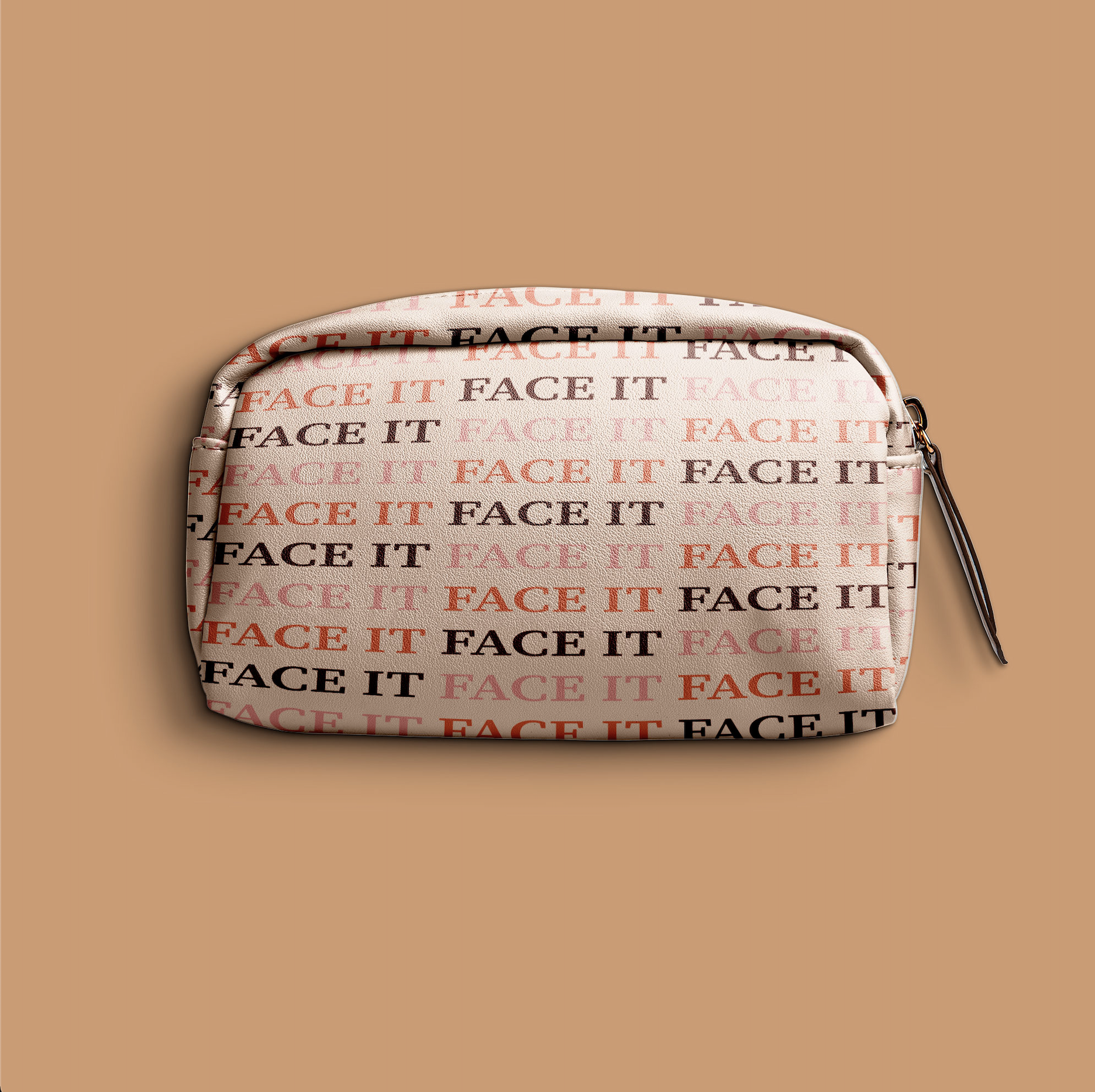
The packaging design was also developed with a similar visual language. The packaging featured the same typography and color scheme as the logo, with the addition of 2 detailed patterns– a subtle geometric pattern that evoked a sense of texture and depth, and a pattern created just with the repetition of the brand name in different colors, which makes for a very distinct look.


Results:
The final product was a cohesive brand identity that accurately stood for the "Face It" brand. The logo and packaging design successfully conveyed the brand's values and aspirations while also being visually appealing and memorable. This branding project helped the “Face It” team structure a working image of their brand that they can use in their future packaged products, advertisements, and social media.